Maplewood Colonial Addition
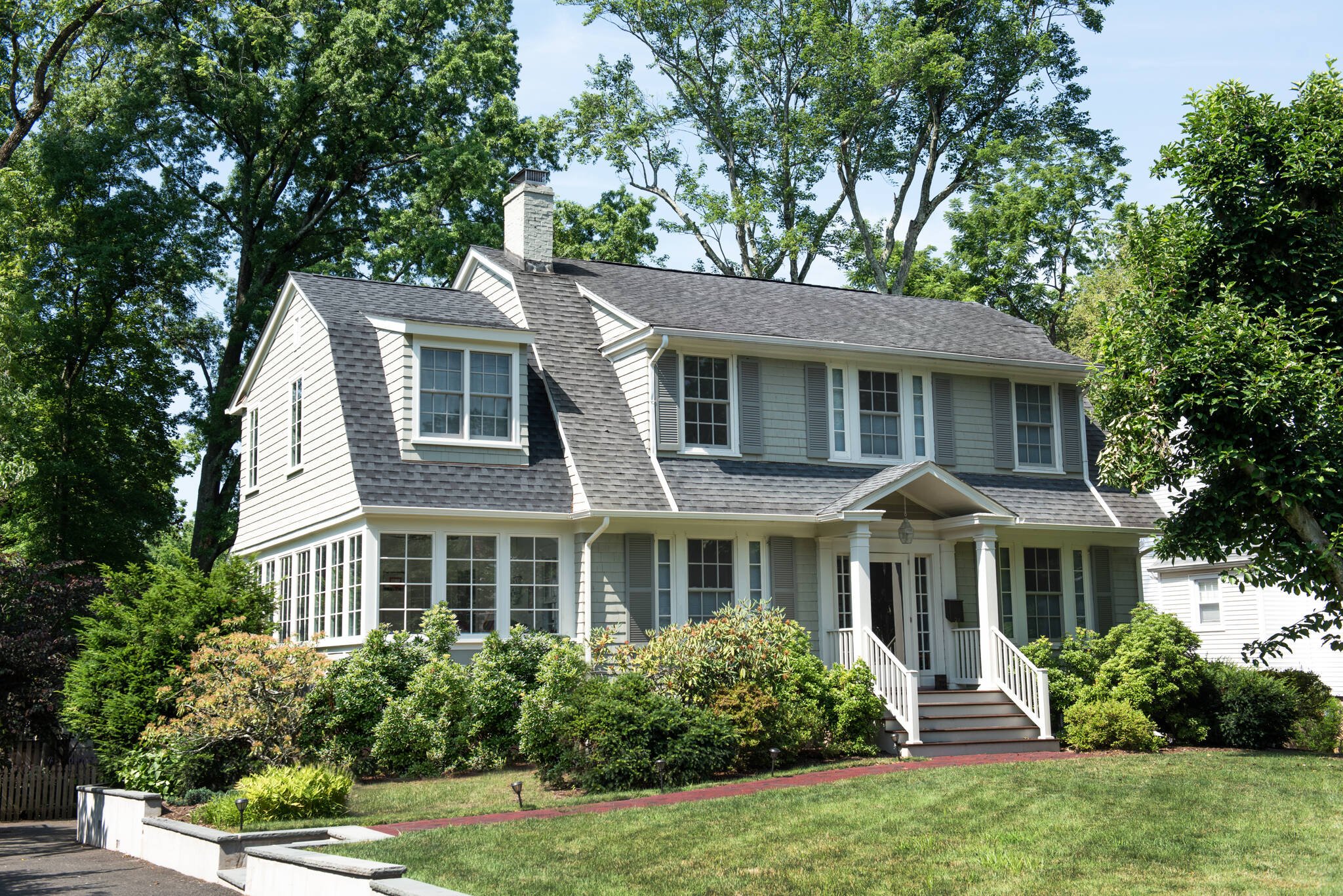
Building upon our prior work in the home, this project had two major objectives. Goal #1 was interior-focused: Improve the functionality for this busy family of four, particularly on the second floor. Goal #2 was exterior-focused: Make the two-story addition appear natural, like it was always there.
We redesigned the sunroom with additional structural capacity and added a second floor above with two new bathrooms and a dressing room. But the addition had to seamlessly integrate a new roof line and exterior elevation with the existing 100-year old home.
General Contractor The Zorel Group
Photography Anna Herbst Photography
Upstairs, we created a proper primary suite with separate bathroom, dressing room and closet, as well as a second bathroom off the main hallway. We also moved the laundry upstairs into a full-size room of its own, which the client describes as “extremely time-saving!”


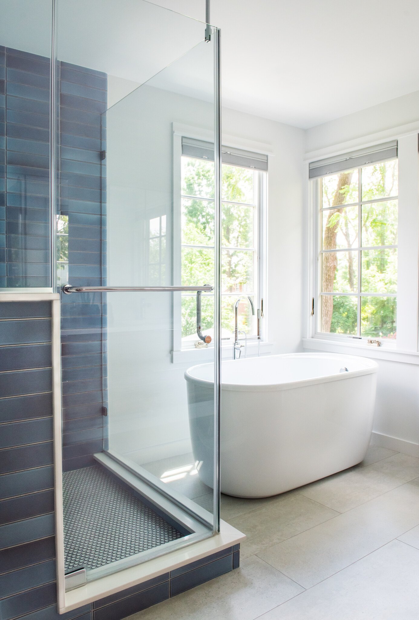
On the exterior, we carefully placed windows to appear like they were part of the original home. A dormer window adds peaceful natural light to the dressing room. Meanwhile, a series of large windows in the primary bath capture the views of the surrounding trees—creating a majestic, “treehouse” effect that truly brings the outdoors in.


Downstairs, we gave the sunroom much higher ceilings, making the kids’ playroom feel bigger and more open. And by adding an office nook, we gave our clients, two busy professionals, a space to comfortably work from home.


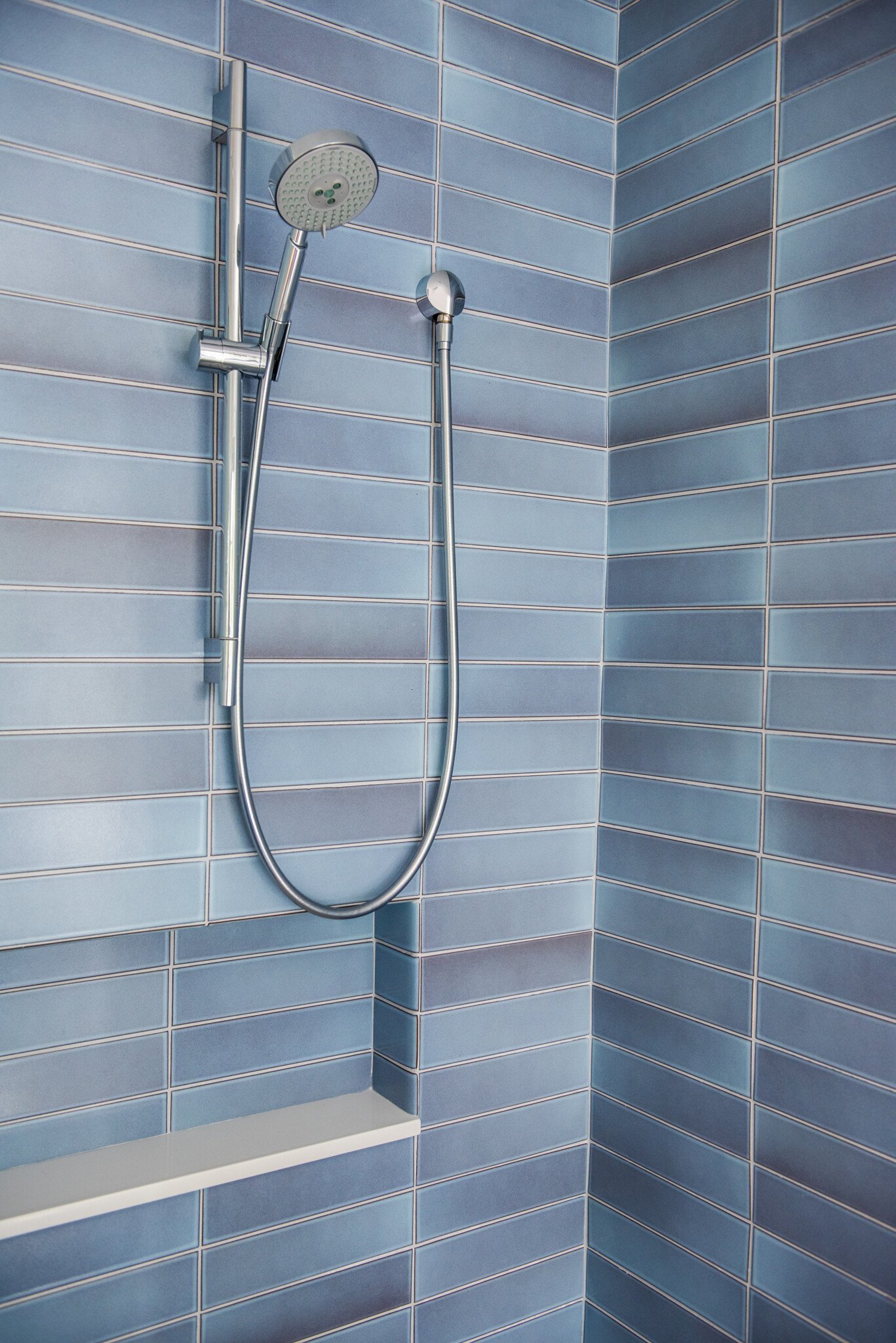
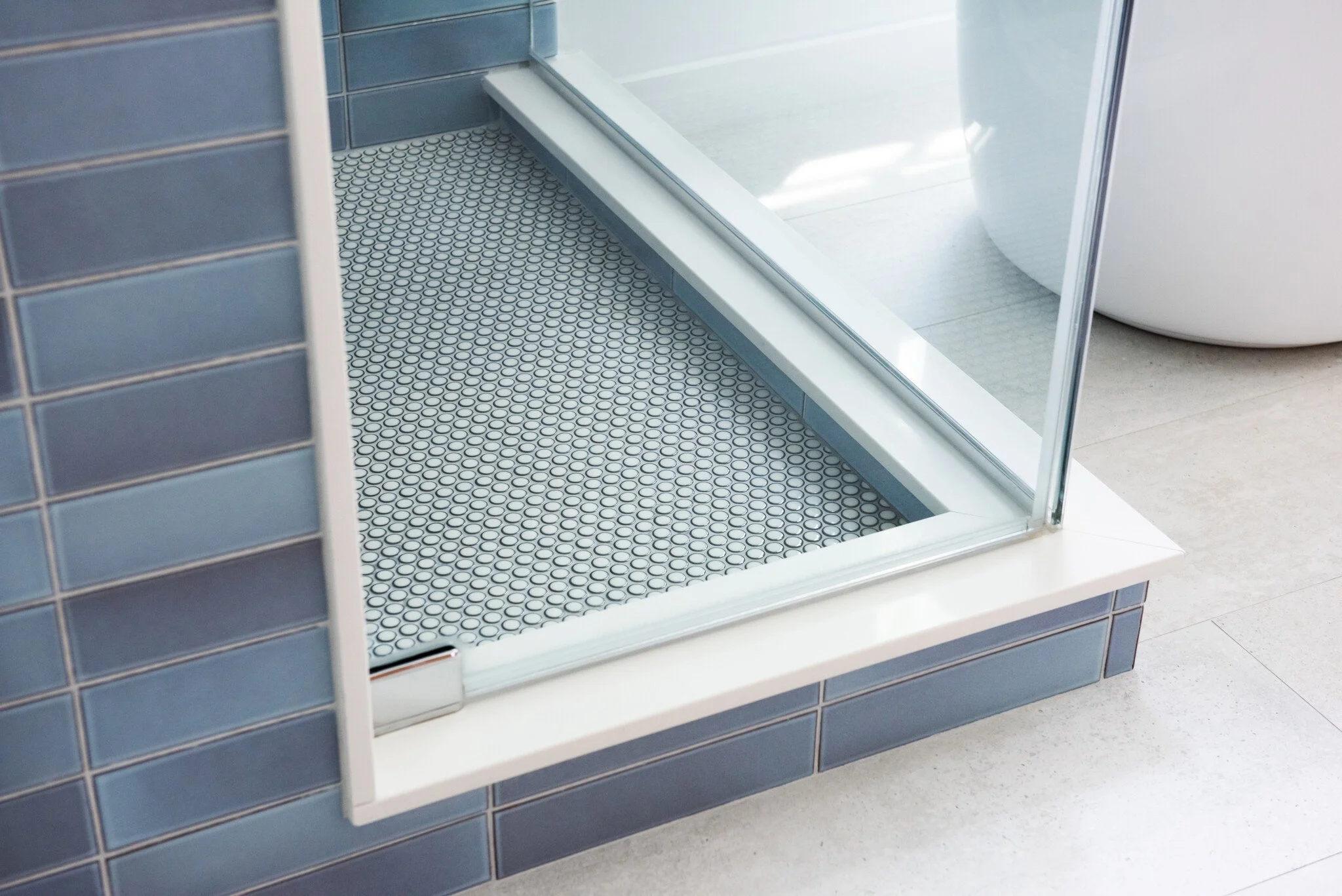
Enhancing the serenity of the primary bath, we carefully selected a handmade ceramic wall tile in a calming, watery blue color. The dressing room accommodates both his and hers wardrobes, and we used the extra space under the roof line to create an expansive and easily accessible storage loft. In the primary bedroom, we designed a custom white mantle that gracefully frames the fireplace. Similarly, a new stone hearth adds distinct character in the living room fireplace.
However, the devil can lurk in the details, so we also made sure to keep the budget in check and maintain the original character of the home. All the new doors matched the home’s original five-panel style, and we kept wood trim and hardware classically modern.
“
They did a phenomenal job of making it look like it was all built in 1923. And they did it in a way that didn’t compromise the internal spaces in any way.
When we first reached out to Idea Space we simply wanted to improve the color palette on the walls and achieve a better flow throughout the home. Within three minutes, Julie resolved what we had been struggling to figure out for weeks! It showed us just how skilled she is. So we went straight back to them for the redesign of the sunroom.”
kate, owner

construction photo

construction photo
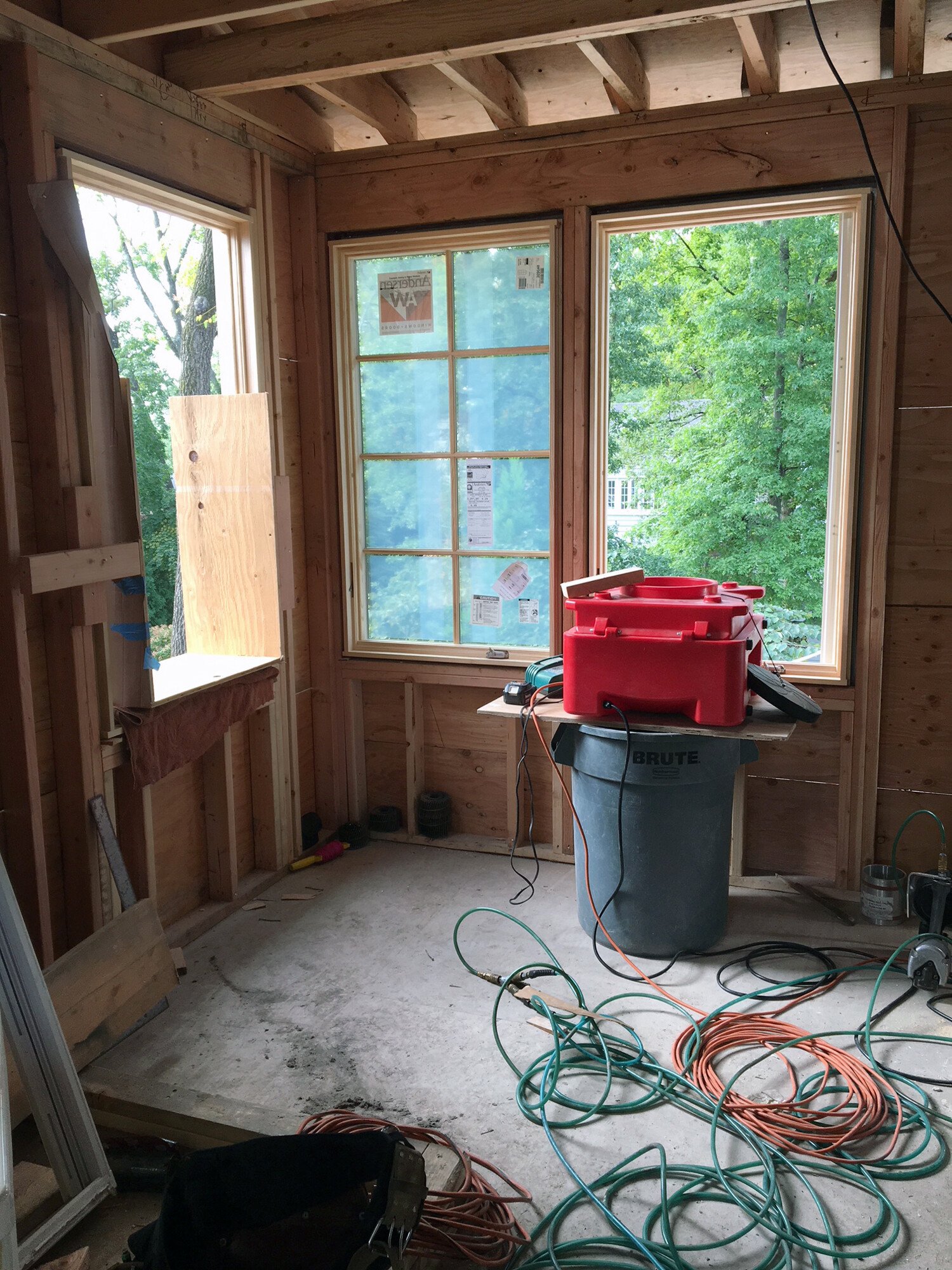
construction photo

construction photo
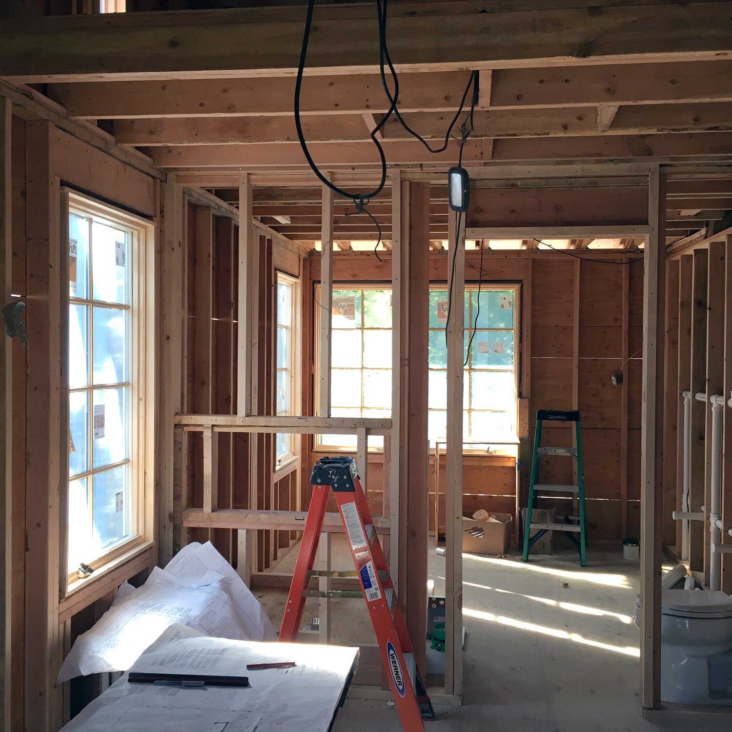
construction photo

construction photo

construction photo
scope provided
Architecture, Interior Design, Furniture & Lighting Selections, Decorative & Art Selections, Interior and Exterior Finishes, Art Procurement, Furniture Design

